[size=9px]Small footnote; I had this whole long thing typed up and halfway through it my peice of crap laptop died on me becasue of a brownout. :?[/size]

Quote Originally Posted by K4Z
Yes, I like the idea of the arms acting as somewhat seperate from the main body.

Maybe he'll walk away from the table and the little arms will be struggling like a person to reach and grab for the table to stop it from falling and when it crashes to the floor, it drops the arms as if it just gave up...
I love that idea, perfect for the comic relief :lol:, but it'll be up to my animation skill if I can pull it off with any success :?.
I suggest taking a page from Disney and Pixar and try acting out the arms reactions with your own hands. The trick is to give all the emotion and personality of an individual person into these arms, with just what features they have, hand gestrures. But try not to get too carried away or corny otherwise you'll lose the viewers and get a 'disconnect' from the character. [size=9px](Sometimes I think if I wasn't a programmer, I'd have end up being a director. )[/size]

Quote Originally Posted by K4Z
I actually used parts of the Judge Dredd Robot as a reference. I really like that style. What I am trying to accomplish with GUS, is a sort of more newer look than that. Still made mostly out of chunks of metal (instead of composite plastics like the Main Character), but everything is kind of smooth and bubbly looking instead of straight and flat. Like a transition between new and old, yet GUS's 'new' look, is on the way out and starting to get old.
(Hope I'm not being confusing, don't really know how to explain it, but hopefully it'll make more sense in a few more updates)

I'm still planing on putting bolts and rivets all over his shell, but that'll be one of the last things I do.

His panel design was a failed attempt to give more detail to his plain sphere of a body . I don't like it either, came out too rounded and smooth. I'll try something else.
So instead you made it more rounded? Interesting technique. j/k

I think instead of giving up on the panels, you should have kept them simple in shape squared off the corners and made them more 'tank-like'. You know that painted metal armour alloy look. But with the stealy hydrolic joints and cables underneath the shell. The shape of the guy is good, but the pattern on his now is too... fancy pantsy... he is an old robot... and considering his line of work, shouldn't have any fancy or new-age patterns on him. :? It goes to throw him out of reality that he's in.

Quote Originally Posted by K4Z
As for his color/surface, it's still a bit early to be worrying too much about it . But to put everyones minds at rest (for now), I made some quick (and I mean quick ) tests.

Heh-hem . Here's a simple UV maping of his right arm. I just used a default brush in Photoshop to chip some paint away. No real diffuse or gloss map, so it looks too new (Yes, it looks horrible, but it's just a start)


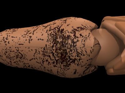
Next up is a procedural map. I just layered a bunch of textures over each other and it came out pretty good. The rust looks better, the paint is more how it should look, nice and flat, and a bit faded.


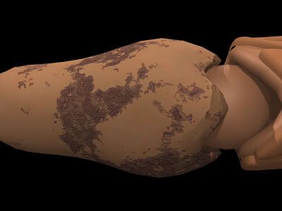
I expanded on the procedural mappings and added some more layers. I tried to give an undercoating, and it's becomming visible as the top coat is chipping off. Also tried adding scratches as a bump map.


Just some tests, nothing is set in stone yet .
I like these examples! It's a good aged effect, just don't over-do the rust. Make it look like a distinct feature rather than a common texture everywhere.


Otherwise I like his direction. It'd be great if each character in the game got this kind of attention.