Page 1 of 10 123 ... LastLast
Results 1 to 10 of 93

Thread: WILL's Prototype Designs

  1. #1

    WILL's Prototype Designs

    WILL messaged me about creating some designs for his MultiPlayer Platform Game.

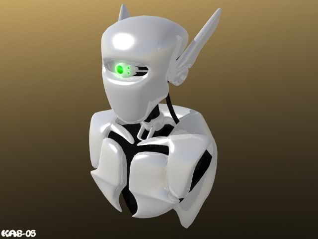
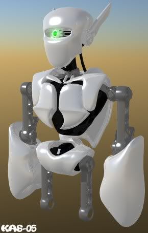
    So, after a late night followed by an early morning I toyed around with some ideas. After a few attemps here's an Android that's starting to take shape: (An idea for the main character, or perhaps a different generation 'Brother' droid)


    C&C PLZ!

    Will, is this the type of design you had in mind? or would you prefer a more chunky Mecha sort of look?

  2. #2

  3. #3

    WILL's Prototype Designs

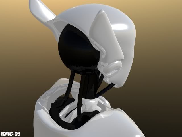
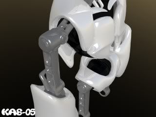
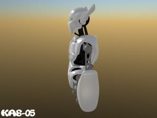
    More shots :


  4. #4

    WILL's Prototype Designs

    looks very pretty, indeed
    Peregrinus, expectavi pedes meos in cymbalis
    Nullus norvegicorum sole urinat

  5. #5

    WILL's Prototype Designs

    Thanx guys.

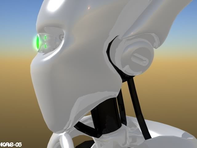
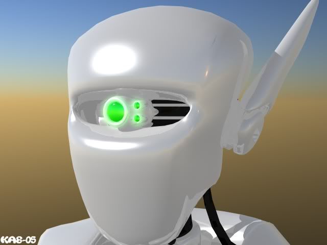
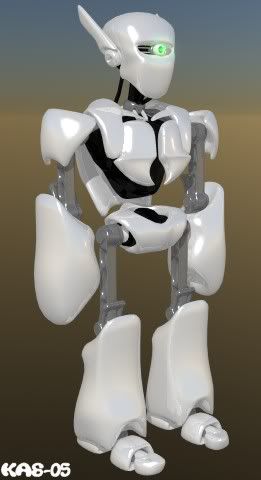
    Here's another shot, he's about 90% complete now


  6. #6

    WILL's Prototype Designs

    The model looks quite qood! I'm not too keen about the one eye though, especially because there appears to be room for two. I'd also do something else with those arms, but I'll explain later why.

    Are there any final thoughts about the size of the sprites? I ask this because I've learned that not every model is good enough to be used as a sprite in a platform game. Especially large, narrow, nonfamiliar sprites tend to loose a lot of important detail when they're resized. (32 pixels is really a problem)

    To show this, I've resized the side view version of your robot (to 58px, ) and already even without legs its showing some problem areas. The large arms for example are not recoqnizable anymore. Adding legs will make the loss in detail even more noticable.

    There's no easy solution for this, but to check what things do when it resized to a smaller version.

  7. #7

    WILL's Prototype Designs

    That?¢_~s some nice modeling K4Z. Perhaps after you?¢_Tre done slaving for MSX and WILL a few low-poly wipeout style futuristic hovercraft for me?

  8. #8
    Co-Founder / PGD Elder WILL's Avatar
    Join Date
    Apr 2003
    Location
    Canada
    Posts
    6,107
    Blog Entries
    25

    WILL's Prototype Designs

    Hey it's looking pretty nifty.

    First thing I have to say is that I like the flow of the white peices! Now I have to do the part I just hate.

    Things to change... [size=9px](It may be long with lots of description, but it's just to give you an insight to my mind rather than pick apart your great work. )[/size]

    I'm going for sleek and simple to start. The robot will be upgraded as you play the game, but for the sake of a good base to start from we should start at the begining. I'll start from the top down.

    1) Take off the 'ears' or wings, as they would be too 'flashy' or fancy for a first model or prototype anyhow. The screw like parts are ok I think, but I may have to see once the wingy looking parts are off to tell.

    2) The Eye... I'm digging the one eye idea... but it'll be better for the enemies, bosses and other things you fight. We want our hero to have a humanistic feel to him so a wider single eye might work better. We could try two seperate eyes, but my fear is that it might end up looking cartoonish, if you know what I'm trying to say. :scratch: If we give him a cyclops (yes from X-Men ) kind of eye peice it might up the cool factor while remaining sleek.

    3) Sholders, Arms & Legs: They are too ratchet-like. It's probably the only part I didn't like too much. There is a kind of electronic muscle called an 'actuator' and it basically works exactly like a human muscle does... only it's controlled by a flow of mechanical electricity. Try thinking of black(or really dark dark grey) cables or cords wraped around a elaborate metal sholder joint for a humaniod looking sholder, knee and elbows... The bicepts and thighs don't need to have bulk to them like a normal human does, but the knees, sholders and elbows need to have a flexable look to them. For all the running dashing and jumpping, right? The hips could be covered in white more with a it more of the 'actuator' look to them aswell.

    You can even get away with partially covering the elbows and knees a bit in more upgraded versions. Or 'shells' I think I shall refer to them as...

    4) Chest... I'd prefer a one peice chest, kind of like a plate of knights armour. You could go all storm trooper on the guy and go that way too... The chest jsut looks a bit caved in or weak... even for a weaker version. Well there shouldn't be more armour on the back than the front I think... It just seems to make him look like he's gonna flop backwards in weight distrubution...

    5) Lastly.. feet... if you can make it look more like one peice the joint or toe part is more solidly a part of the main part of the foot it's look a wee bit better.

    Well thats about it... Considering that it's only a first concept (and that there were no other versions done), I'd say that it's a great start. Normally when an artist comes with concepts he'll have several there and the 'co-ordinator' guy will point out which ones he likes most,the artist will then go with those and make several more concepts and from those the one gets chosen.

    But we're hardly a big company so we have taken up reading minds and witchcraft to meet our goals.

    :lol:

    Nice stuff KAZ! Don't get get discouraged, I like what you've done. Gimme more and we'll get this guy into the game. (Literally!)
    Jason McMillen
    Pascal Game Development
    Co-Founder


  9. #9

    WILL's Prototype Designs

    Cool, thanx guys, constructive criticism is really helpful.

    This guy is just a preliminary design, something to show WILL so he has something to say Yay or Nay to. So I really don't mind too much about hacking him up .

    Here's some thoughts, most of which I agree with whats been said.

    Eyes:
    Originally he had to two eyes, but as WILL said, it did make him look rather cartoony, with a dumb look on his face. I'll just need to experiment. Having one eye piece like x-mens cyclops would probably look too robocop , and it would take away any expression and feel away from the face. (As much expression that a robot could have :lol: )

    Render Size:
    The final frame size will be 48x64. So I have a bit of room to work with. Of course, trying to render the model in it's current state into those dimensions would be hell; I've modeled it in high res to help give me a more detailed view on specific parts. This helps enormously when I do a low poly version for rendering, or when creating pixel art.
    When the time comes, hopefully I'll have it all sorted out

    Ears:
    (lol I actually the started the whole model with the ears first )
    It was the design of the ears that set the style for the rest of the model. Without them (or with smaller ears) it makes his head look too small and odd shaped. They really help to 'flesh out' the shape of the head.

    Sholders, Arms & Legs:
    I don't really like them either, I just quickly added anything so you can see the overall shape. I had thoughts about creating the Electronic Muscles, but then the model would start to look those those crappy robots in iRobot :? . But yeah, this is defiantly one part that's need to change.

    Chest:
    The chest is always the most challenging part to model. He does look a little weak, especially if he's the main character. This part is going to need the most work/changes to get looking right. Having a fully 'Enclosed' chest makes him chubby looking, kinda like a snow man :lol: . But I have ideas on how to improve this.

    Feet:
    I hate modeling feet, lol. Feet are really annoying to model, they are so simple looking, but hard to get it to look just right.
    I kept animation in mind while modeling though, it's hard to see but the foot is one piece, with the 'toe' able to bend, so it has a more fluent walk cycle. It didn't look right without the toe, but I can just chop it off


    So, yeah, thanx heaps for clearing up exactly what your looking for. This is the first of hopefully many many more designs, So I don't really care how much he changes.

    And to quote WILL from a message,
    '... also keep in mind that the hero is the hardest to create. You can hate a small enemy or even a boss in a game, but you CAN'T simply dislike or hate the character in a game that you are playing'

    The main character is always the one that takes the most criticism, it will make or break the game.

    Remember to point out bits you hate, and the bits you like and want to be duplicated more.

    ---

    That?¢_~s some nice modeling K4Z. Perhaps after you?¢_Tre done slaving for MSX and WILL a few low-poly wipeout style futuristic hovercraft for me?
    Lol, maybe I should charging

  10. #10
    Co-Founder / PGD Elder WILL's Avatar
    Join Date
    Apr 2003
    Location
    Canada
    Posts
    6,107
    Blog Entries
    25

    WILL's Prototype Designs

    Hmm... well reguarding the robot's expression it can change via color and level of light emitted from his eyes. Also his stance will reflect his attitude combined with his eye-peice. But I'm not stuck on any ideas, it is just one of many things to try.

    Ideas for features I'd like to consider taking from: Mega-Man(now, it was very much an anime-type cartoonish theme, with big bright blinking eyes and all, but some of the body designs and features were pretty darn cool, esp. when you got to the later additions at the end.), I, Robot yes I know you don't like them overall, but I'm refering to just the NX-5 models' idea of the sholders, knees, etc... at least how I remember them anyway...

    The Matrix has another inspiring set of features for robotics. I'm not talking about the squids and the funky screensavers, but more the materials used and such.
    Jason McMillen
    Pascal Game Development
    Co-Founder


Page 1 of 10 123 ... LastLast

Bookmarks

Posting Permissions

  • You may not post new threads
  • You may not post replies
  • You may not post attachments
  • You may not edit your posts
  •