Page 2 of 10 FirstFirst 1234 ... LastLast
Results 11 to 20 of 93

Thread: WILL's Prototype Designs

  1. #11

    WILL's Prototype Designs

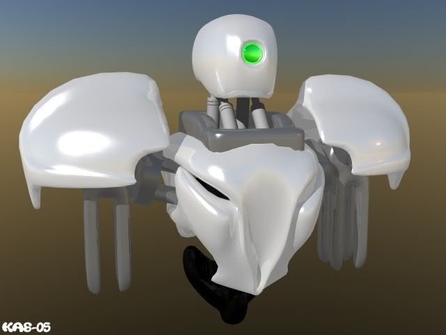
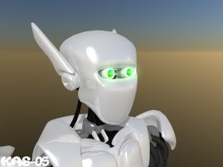
    Ok, I've done some changes.

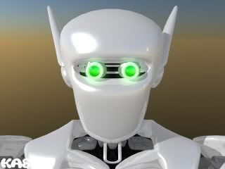
    He here is with two eyes:

    I dunno, he looks kinda doofy like that, like his eyes are wide open :shock: .

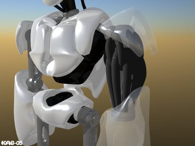
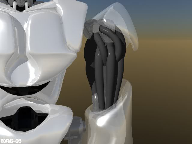
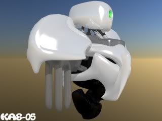
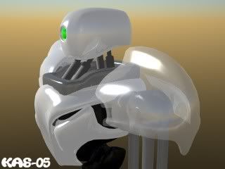
    I also started experimenting with the 'Muscles':
    (Also modified his chest, enclosing it more)


    They are comming along well, still needs a lot of tweeking. I don't really know how the hell exactly I'm to attach them to the frame though.

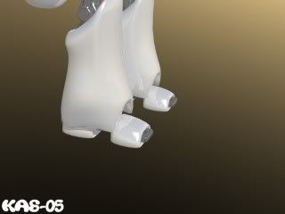
    and..feet, yes:


    ---

    Yes, mega man had a very cool style, in fact, I think i'm going to play it right now.
    The Matrix has an awesome style of robots, don't know if I could ever come close to matching anything like that

  2. #12

    WILL's Prototype Designs

    One eye looked better I think. :shock:

    firle

  3. #13

    WILL's Prototype Designs

    I prefer the two eyes, but they look like they are stuck on as an afterthought. What if they were elliptical (major axis being horizontal) and set back into the head a bit further? Beneath and behind the eyebrow instead of being in front of it.

    I'm not sold on the 'muscles'. I think you still need to see part of the frame beneath.

    If I remember rightly, MegaMan had oversized feet which a lot of these anime style robots do.

  4. #14

    WILL's Prototype Designs

    Before I start I usually go out to do some research. Helps lots for inspiration and all. Sometimes I even hit jackpot.

    Here's a sample including multiple animation cycles + full size model

  5. #15

    WILL's Prototype Designs

    I think K4Z's Droid looks way better than Megaman, I like the style of the new Droid. Some Images in the size of the later game would be interesting. I would use it!

    Firle

  6. #16

    WILL's Prototype Designs

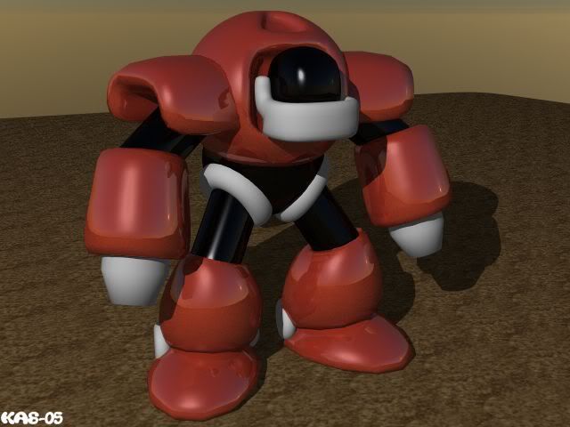
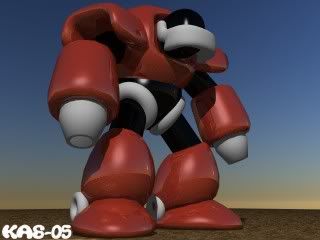
    Here's another design in the works, with the same style as the previous robot. He's much more 'Buff', perhaps a Gaurdian Bot from a more Combat oriented generation.

    (This one is actually based off a design I started before the robot above, hence the one eye :lol: )


    I've also got some completely different designs on the go too, more mega man astro boy-ish. But I don't think a Chibi kinda style would be better, Who (How old) is the target audience? (I mean the story, so far, is really good, it desevers a more 'Mature' style I think.)

    Keep the C&C comming!

  7. #17

    WILL's Prototype Designs

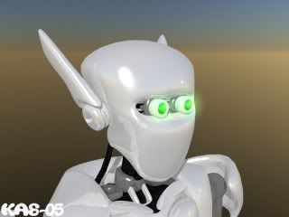
    Oh, and thank you Sly, that helped heaps. Didn't think of putting his eyes INSIDE of the head, lol. It looks much better now, I think I may just like the two eyes now .

    Before and After:

  8. #18
    Co-Founder / PGD Elder WILL's Avatar
    Join Date
    Apr 2003
    Location
    Canada
    Posts
    6,107
    Blog Entries
    25

    WILL's Prototype Designs

    Oh some more feedback... I think we have lots of great stuff here!

    <center>
    This image works best to explain my point best I think.</center>

    I like this head shape, with the 'ears', but not for the first version... It'll be an upgrade! But I think we'll use it. It simply looks great from the side.

    However, I'd like you to try and modify it, removing the top point object above the screw-like object. And to eliviate the akwardness of the head... just round it off nicely, but just a bit so that it looks like the sides of the head near the temple is more paralell with each other.

    For the hips maybe another white peice to cover up the complexity of the joint. (a sort of cheat, but with a cool-factor result )

    One last point is on the arms... if you can make them look 'slightly' corricated-like just to solve a curiosity of mine(if it looks bad then we'll to back and try something else to make them look more like REAL cable-like looking) and also tighten them together more so they look stronger. It'll help to not have any small gaps between them when spriting them aswell.

    Oh and of course the chest still needs some work. Hmm you know what? Try checking out Robocop or the new Starwars Trilogy for ideas...


    I like the new(I guess original one) all the while peices are perfect! Perhaps trying to put a metalic ring around the light to make it look like an installed peice(if you know what I mean). Try the same thing you did with the main character's neck(the black part) on this one... and then try to enhance it with those, hydrolic looking peices a bit closer to it, but attached below the collar peices. It'll make it look more functional that way I think.

    Some great ideas KAZ, keep em comin'!


    [size=9px]Oh and nice MegaMan sprites Alex. [/size]
    Jason McMillen
    Pascal Game Development
    Co-Founder


  9. #19

    WILL's Prototype Designs

    Ok, I'll get right onto those changes.

    While modeling I try to keep in mind that during the game the main character will change. So most designs are not quite the finish product, not quite 'Prototype' look, somewhere in the middle. Hence why the design is made up with seperate white pieces, makes it look functional but not quite finished. So some bits will be removed for early game sprites, and put back for later game.


    ---

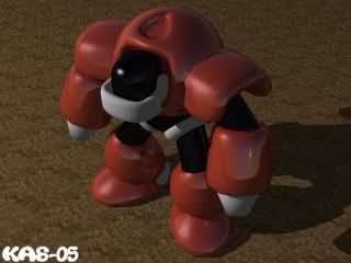
    Here's a more MegaMan style of robot, Very simplistic at this stage, just to get a feel for the look:
    ( An idea for a bad guy )


    Yes? no?

  10. #20

Page 2 of 10 FirstFirst 1234 ... LastLast

Bookmarks

Posting Permissions

  • You may not post new threads
  • You may not post replies
  • You may not post attachments
  • You may not edit your posts
  •